As an airline Customer Service Specialist. I need to be able to help customers cancel items related to their travel (trips, passengers, special services, etc.), so I can resolve the second highest reason customers call.
This airline handles thousands of customer issues each day by phone. Hundreds of customer service representatives (Specialists) all lean on the same set of tools. However, the primary tool is over 10 years old and carries many inefficiencies.
How might we update the tool and improve the usability and user efficiency without diminishing other critical functions?
For this project I was responsible for UX research, UX strategy, Interaction Design, Visual Design, and leading and managing the UX team.
I started this project by gathering stakeholders and asking a set of questions I comprised several years ago. These questions involve the product, strategy, users, business, and surrounding system(s). Having answers to these questions allow me to identify knowledge gaps and recommend a research plan that meets the project objectives. We identified some crucial research activities:
Since the existing tool was seen as "hard to use" and "repetitive", I thought it would be best for us to build a set of Task Analyses to measure and mark a few user flows before and after design was complete:

From this phase we were able to uncover several problems. The top two were...
While synthesizing the research, I also wanted to draft a UX Strategy Blueprint* for the entire product. This would allow the team to clearly outline the product strategy and establish design guiding principles. These principles were essential to the subsequent tasks in design, and we constantly used them when grading concepts. These were our top "Guiding Principles":
*Thank you Jim Kalbach for creating this template!

At the start of the design phase, we focused on conceptual approaches to solve the problems at hand. Lo-fi, quantity over quality. To keep each other fresh and motivated, I set up daily "collab" times where a designer could take the stage, propose a problem to solve, and then kick off the group into a wire framing session. We invited the entire team to take part in the process. Afterward, each person walked through their designs and talked about their rationale, which intentionally laddered up to our "Guiding Principles".

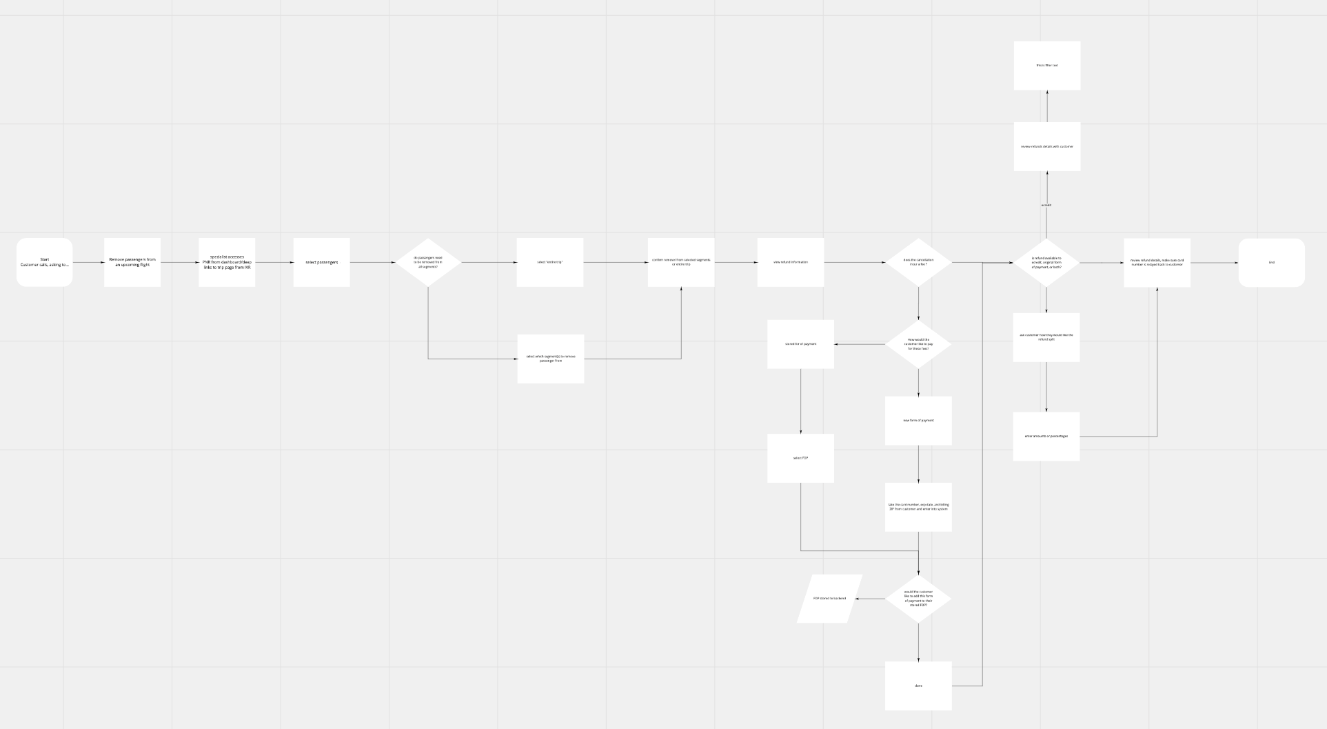
One challenge to highlight was the complexity of the process driven by unstructured customer goals and a complex set of institutional rules. To surmount this, we created cheat sheets and set up lunch n learns to preface design work. We also created conceptual maps before any wireframes to make sure we could articulate how the solution worked and prove it could address complexity.
We arrived our final design by iterative testing with real specialists via usertesting.com. Our final design was tested with 5 Specialists from 5 different customer service groups. We found no thematic usability issues and measured our original metrics in task analyses. We built a prototype of the current tool so performance would not be an issue and found...
As the design evolved, the Engineers beaome more involved. For this project, the engineering team specifically requested to stick close to design system components with minimal changes. I conducted weekly status meetings which became more of a "component map" review as time went on.
In this role, I also served as the Lead over the design system in Figma. It was our goal to make design files easily consumable by the engineers, so we built components just like they were going to build them. We also employed a set of best practices - topping that list was "Stay DRY (Don't Repeat Yourself)".
In tandem, I created a comprehensive "States Doc" (a list of conditional statements) that would accompany the visual specs and assure the team we were covering all the use cases.

2 months after deployment, the team measured success and found the following:
One thing I found particular success with is tying design rationale back to the UX strategy. The Client really appreciated the correlation and it gave the strategy more weight as the project progressed. Another practice that the development team really appreciated was the "States Doc". They really loved having full transparency to the functionality of the proposed design (not just "happy path" flows).